Unique brand character
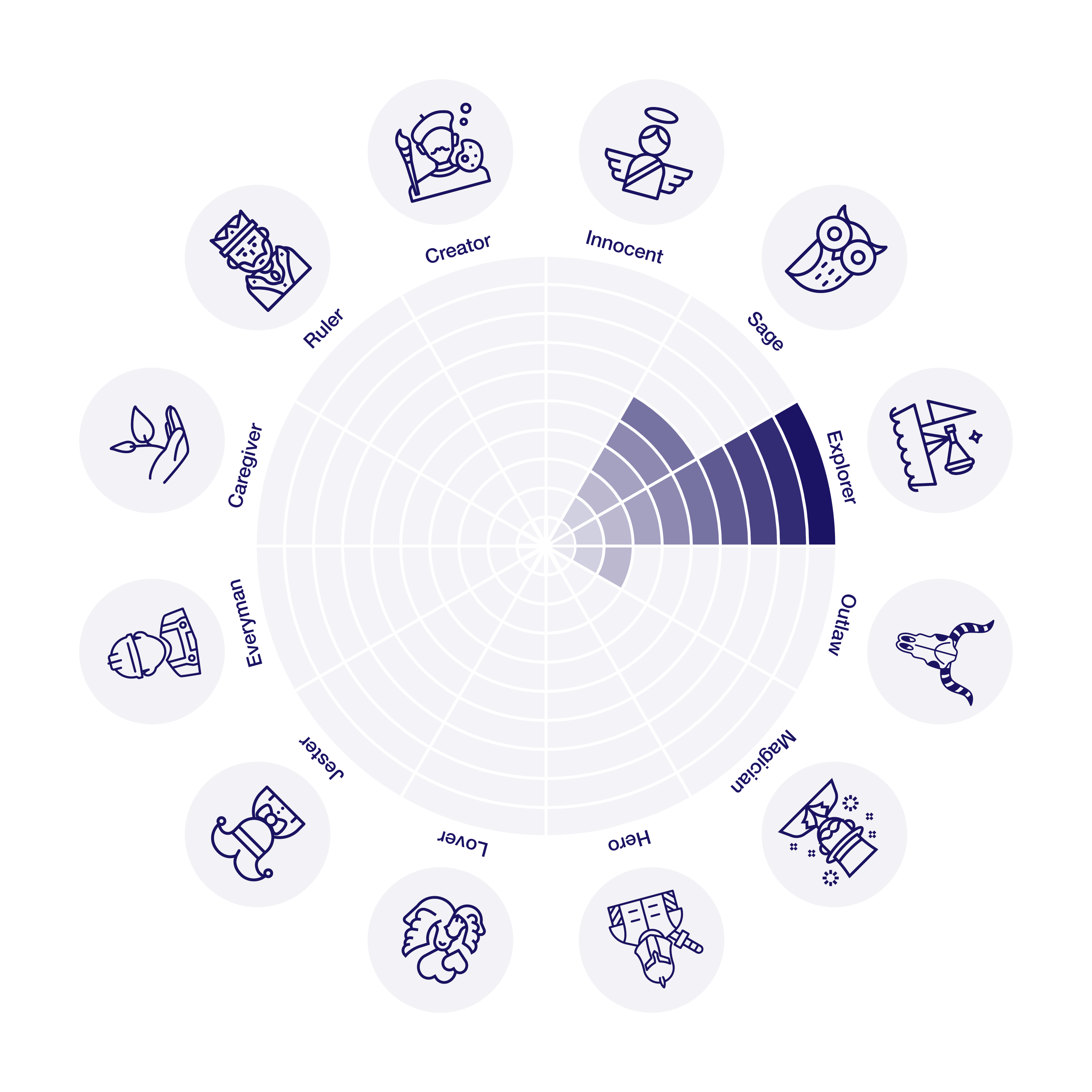
It’s hard to turn down an invitation to join an expedition from an experienced team of guides who are passionate, eager to explore and ready to face any challenge. Collaboration on a development project from Valta Engineering should be equally attractive.
As an added bonus, this team also offers unique skills in management and effectiveness (Sage) and the courage to step off the beaten path of convention. All of this provides the prerequisite to achieve unparalleled results.
Theses of association building
An explorer seeks out new challenges and is ready to face them successfully.
The discoverer is rational. He does everything for the success of the expedition.
The discoverer is courageous. But always ready (like a pioneer :-)).
Message to the audience.
Association building tools
The logotype itself (the written part of the logo) contains two words. The first “VALTA” (power/strength from Finnish) is in line with the defined group of associations. The second word “ENGINEERING” describes the key activity.
To support the group of associations of the explorer archetype, a graphic symbol needs to be added to the logo.
A reliable tool is needed for journey planning. With it, the right destination can be set. Such a tool has historically been a compass. Its streamer is steadfastly pointing north correctly. The compass needle is therefore a prerequisite for any expedition. The strelka is equally used today as a symbol in navigations and serves equally to direct the right way to the destination. The compass needle carries key associations for us (challenge, planning, journey, destination).

A slogan will conclude the associations’ information package. It will carry the associations of the complementary archetypes “SAGE” and “OUTLAW”.
The overflow of invention is impossible to stop. That’s why the passion of artists and innovators is their indispensable need. This is what the slogan “ready to create” communicates in the form of a seal that will be part of the communication identity. The form of the seal or label will indicate the importance and necessity of this ambition. Its suppression would lead to frustration, just as we can observe with many great creators throughout history.
Logo
A view of the brand logotype without the slogan.
A view of the brand logo with the slogan.
The brand slogan can be freely positioned. The aim is to emphasise freedom as an essential part of the creative process. Combined with a logotype that shows a clear direction towards the goal, we create a complete message and the prerequisites of a successful project – the courage to create freely and innovate is linked to the ability to achieve the set goal in an exceptional way.
The slogan can also be displayed in negative colours.
Sample applications
A company’s identity should run through all elements of the company that have the potential to convey a message to important audiences. Important audiences include, in particular, clients, employees and suppliers.
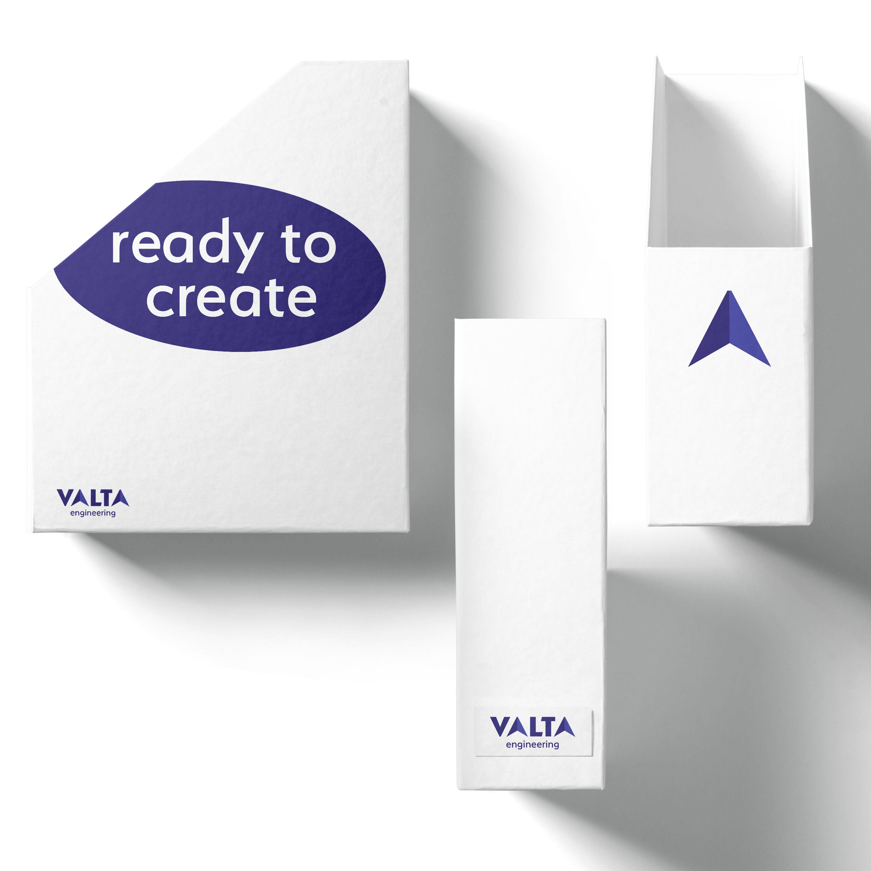
Using the seal of the slogan in a cut-off shape reinforces the sense of urgency. The element is placed there even if there seems to be no place for it. It reinforces the message, “We want to create at any cost.”
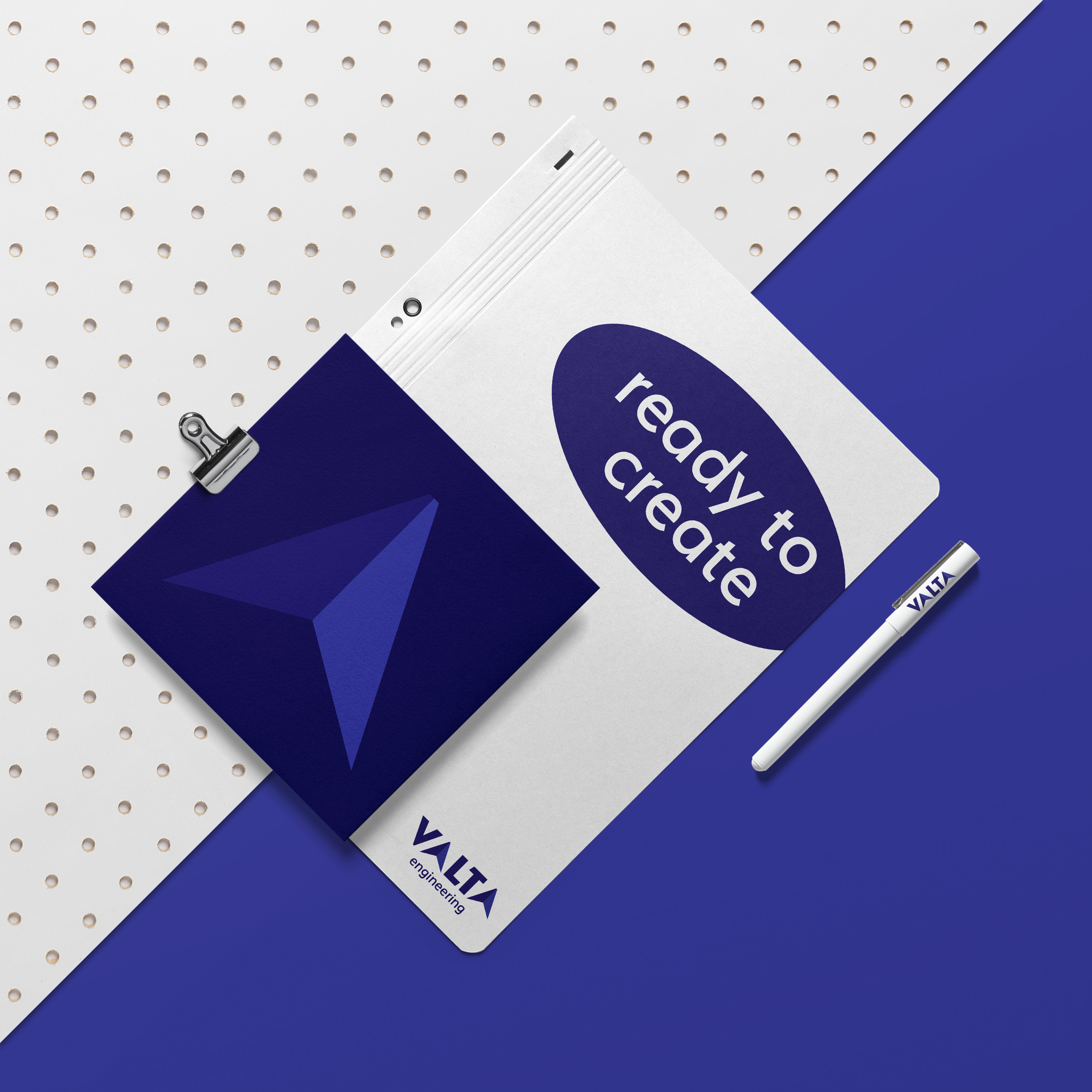
The “shooter” symbol can also be used alone to indicate or represent the logo itself.
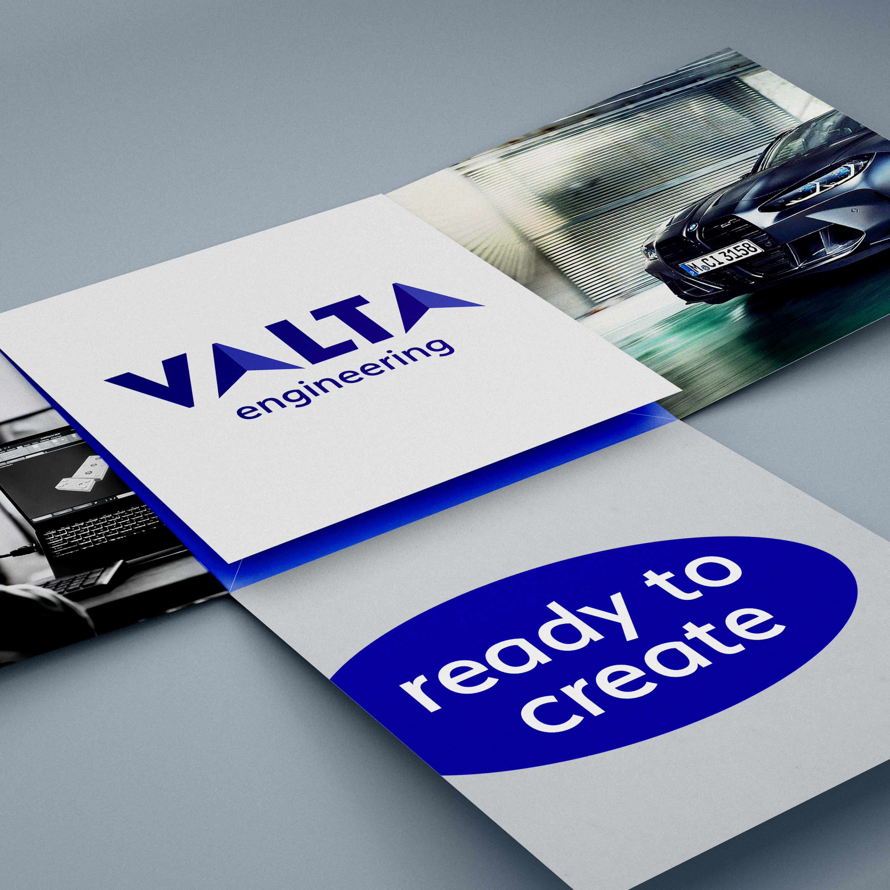
Presentation materials should be creative, bold and unconventional.
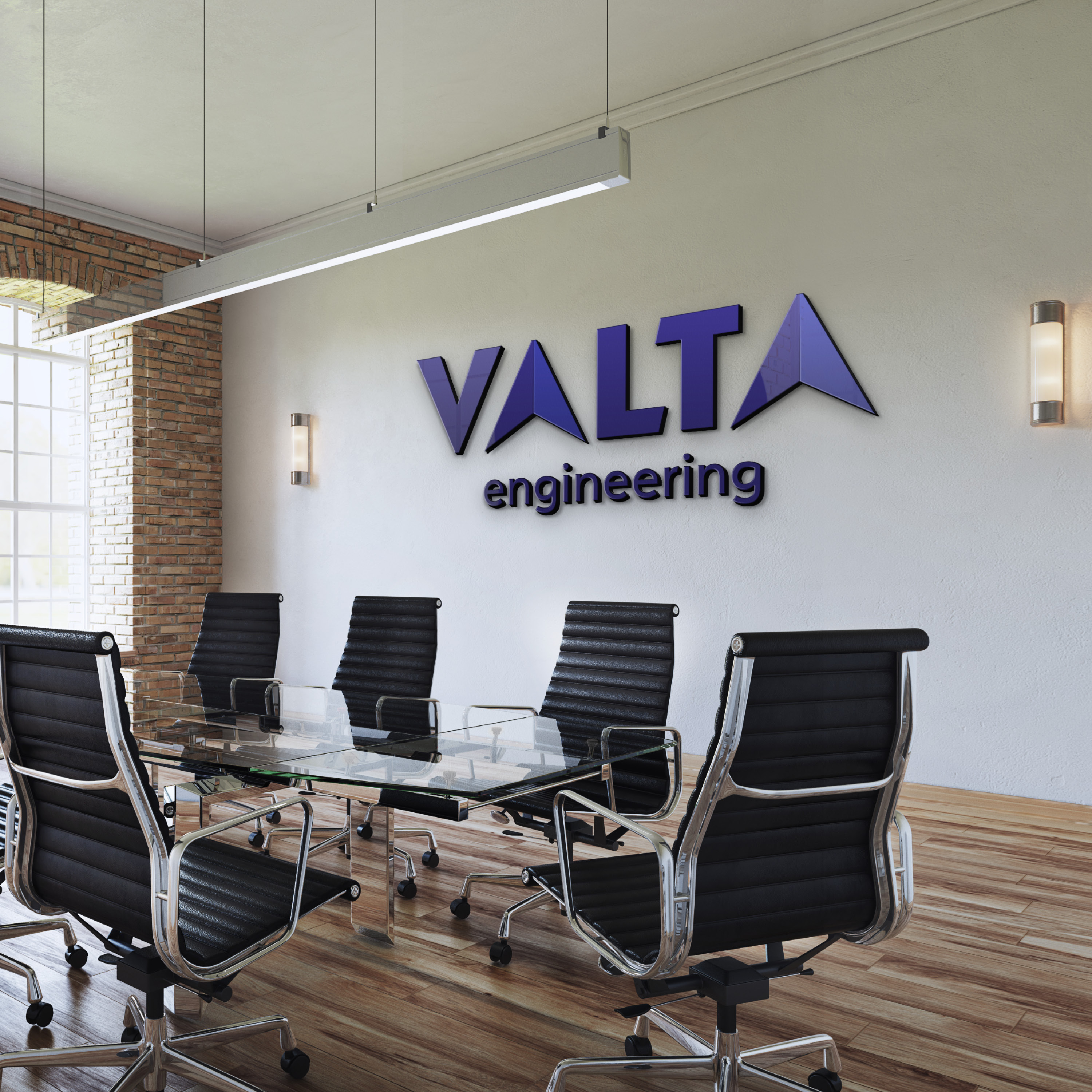
Example of use in interiors
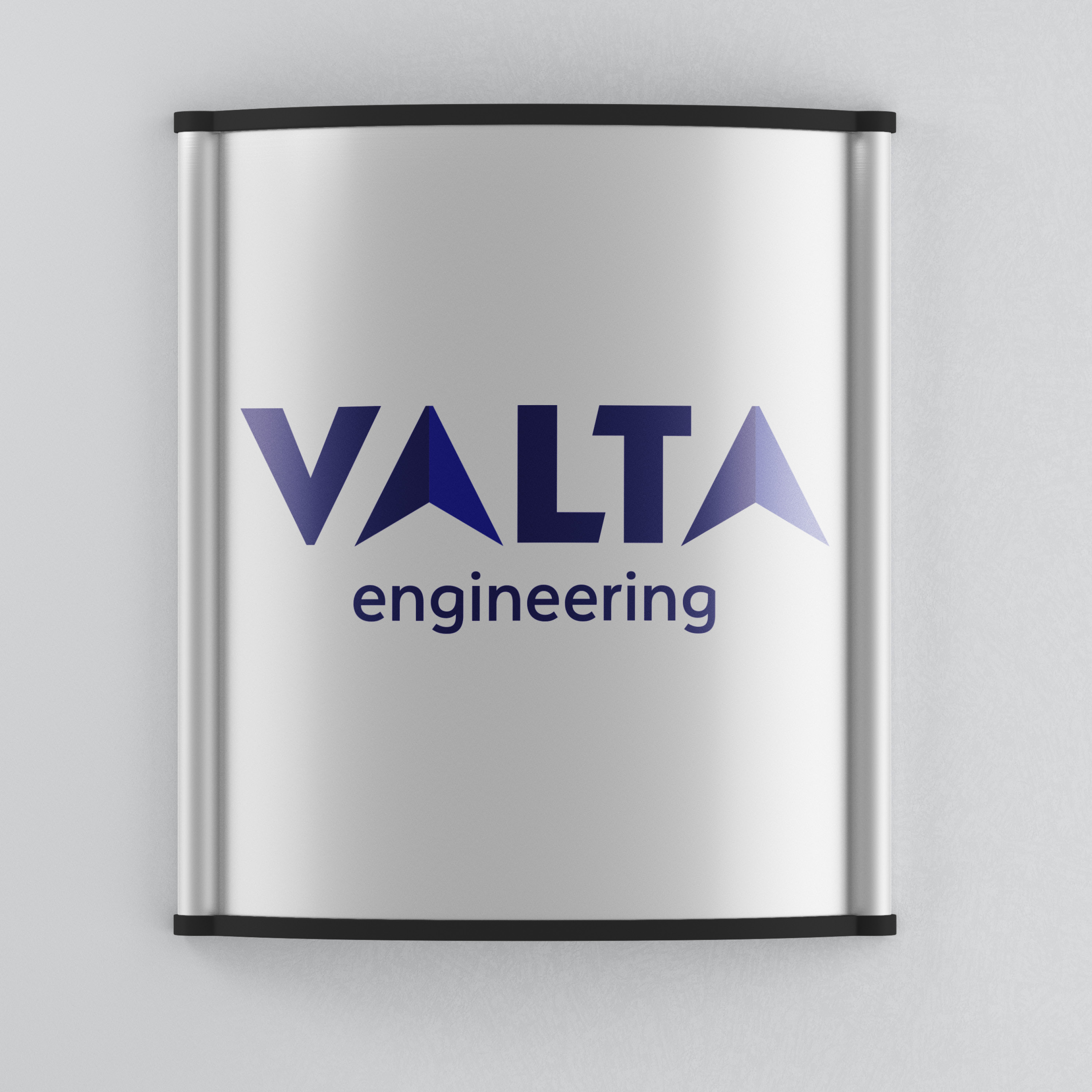
Example of application on aluminium in full colour
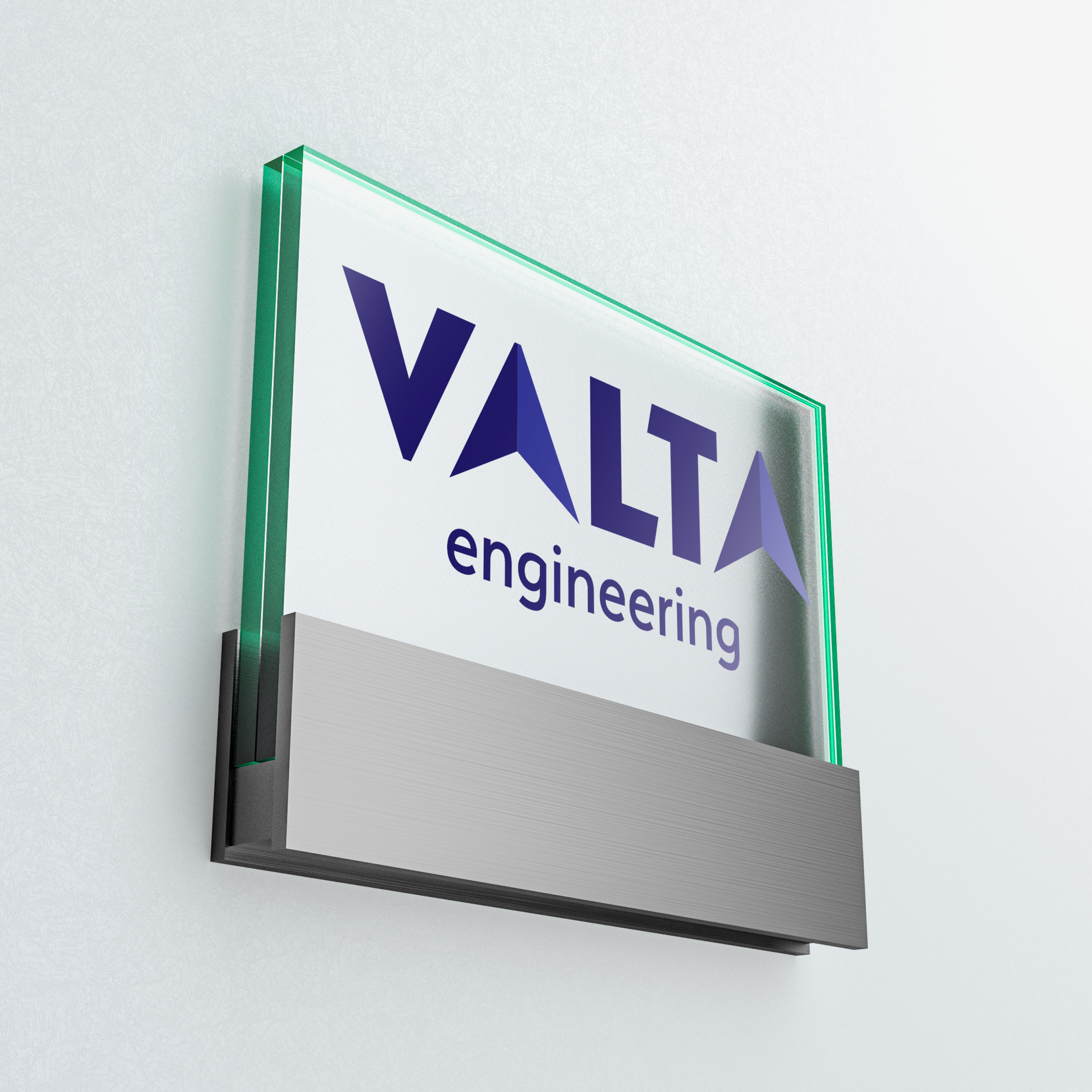
Example of application on glass in full colour
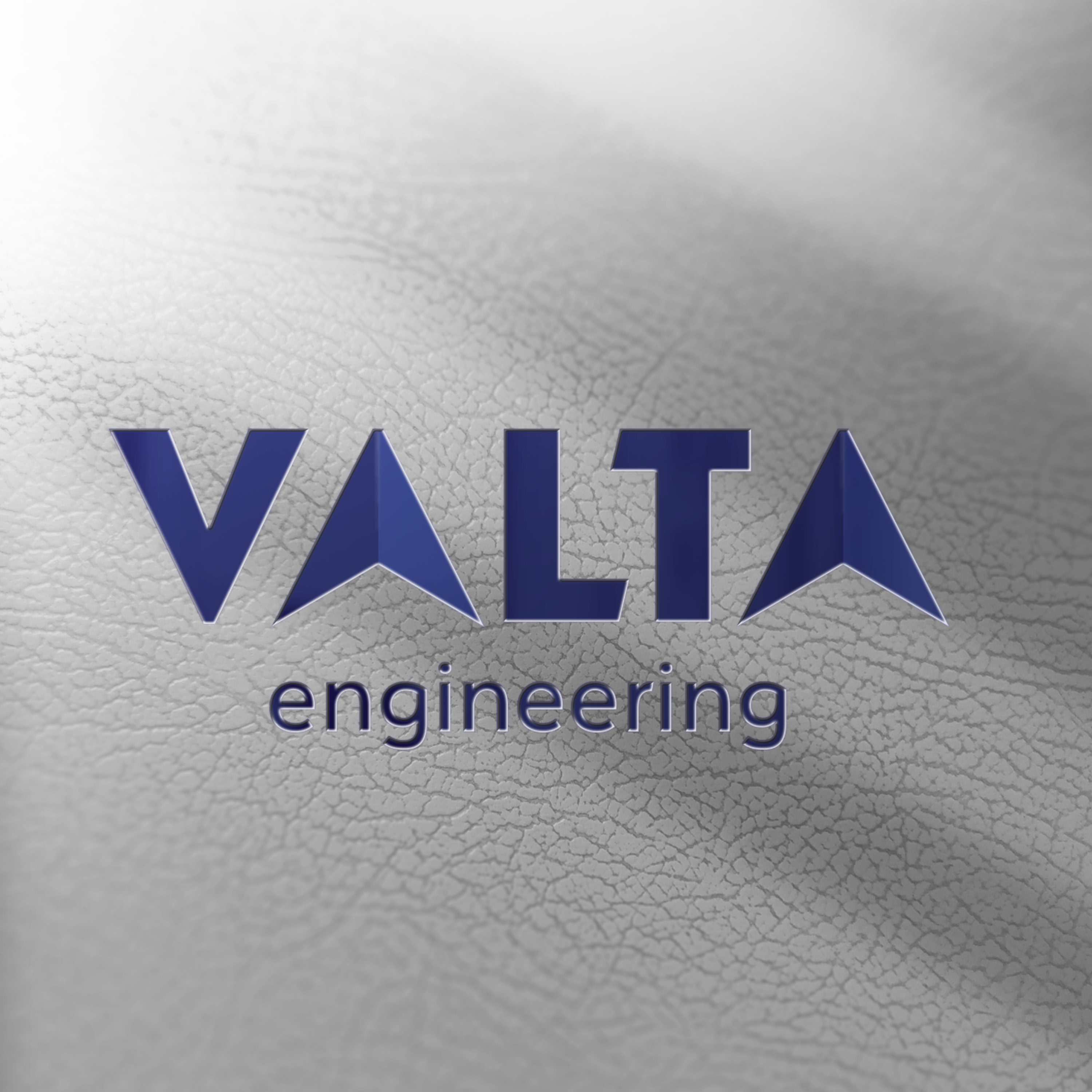
Razba to the skin.
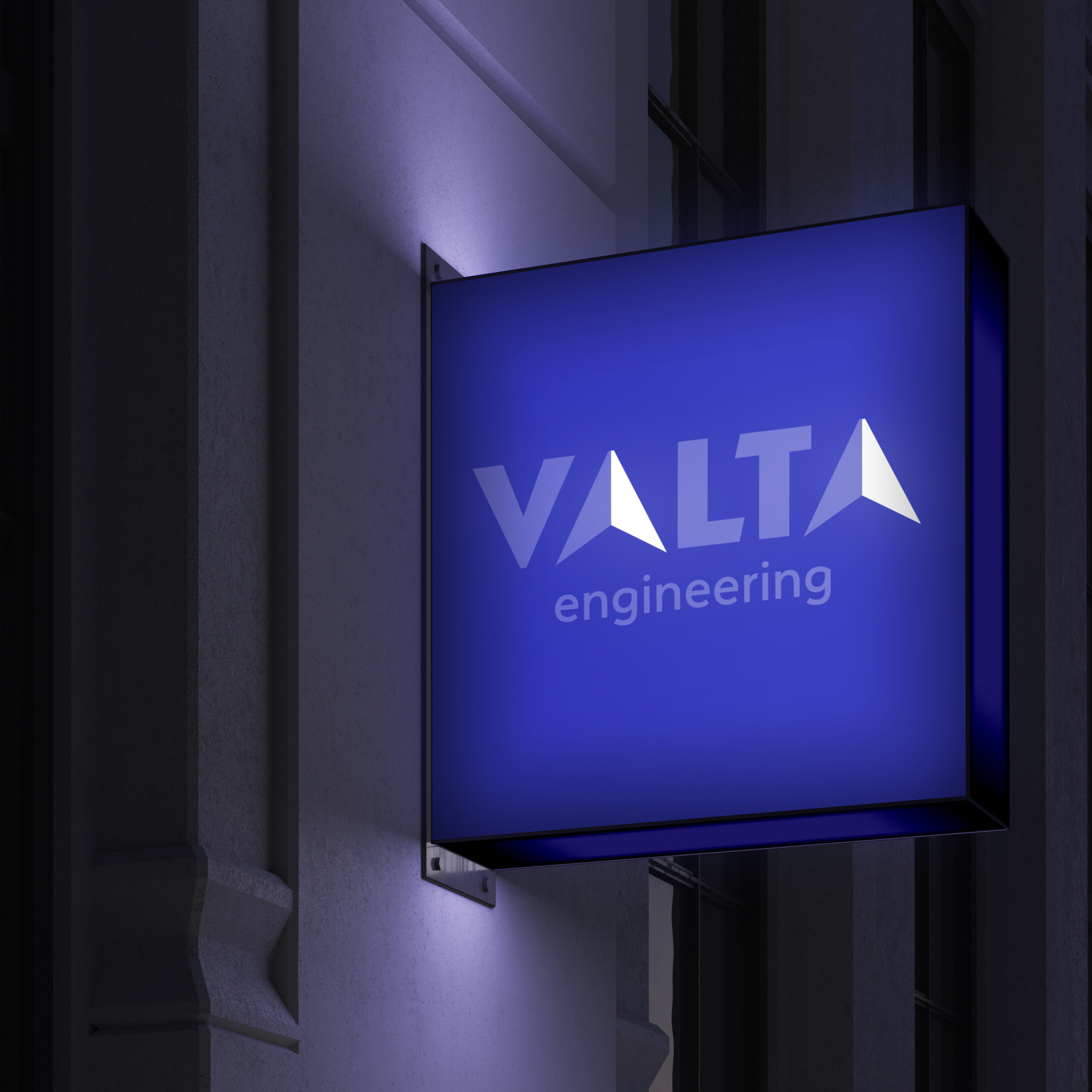
Example of the application in the negative on the blue area.
