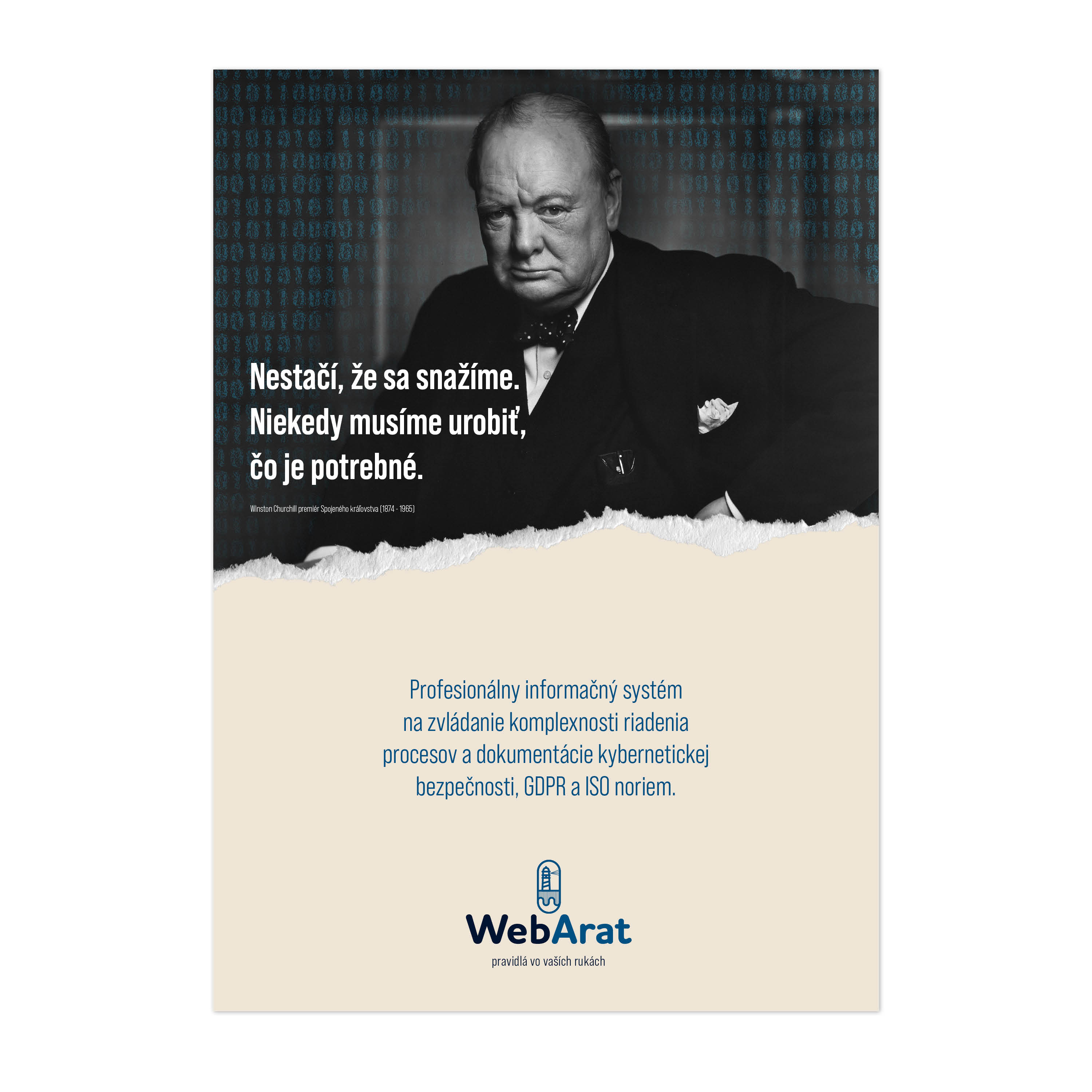
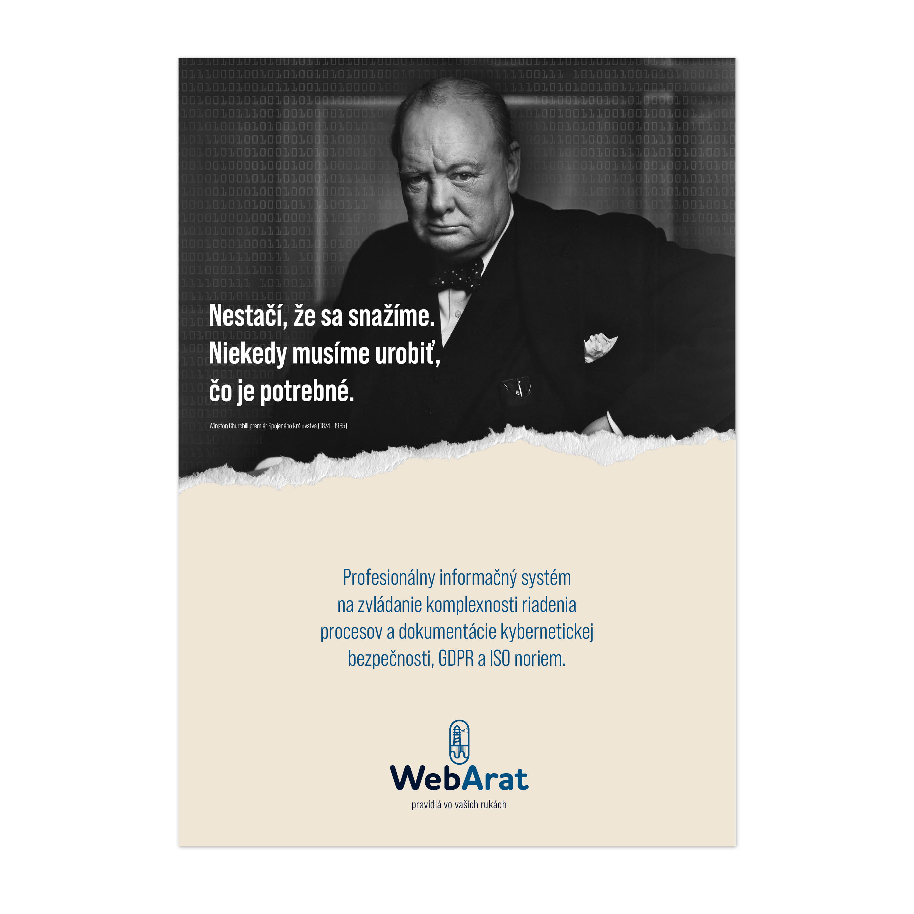
Based on the consultations, we decided to consider the communication style according to the archetypes Caregiver and Ruler. The dominant archetype was chosen to be the “Ruler” archetype. Using the “Ruler” archetype, we are able to convey the message: Take responsibility and define the rules. Secondarily, we will rely on the Caretaker archetype because all these decisions are guided with the intention to protect the company (firm, organization) from attack and to handle all the obligations imposed by the state.
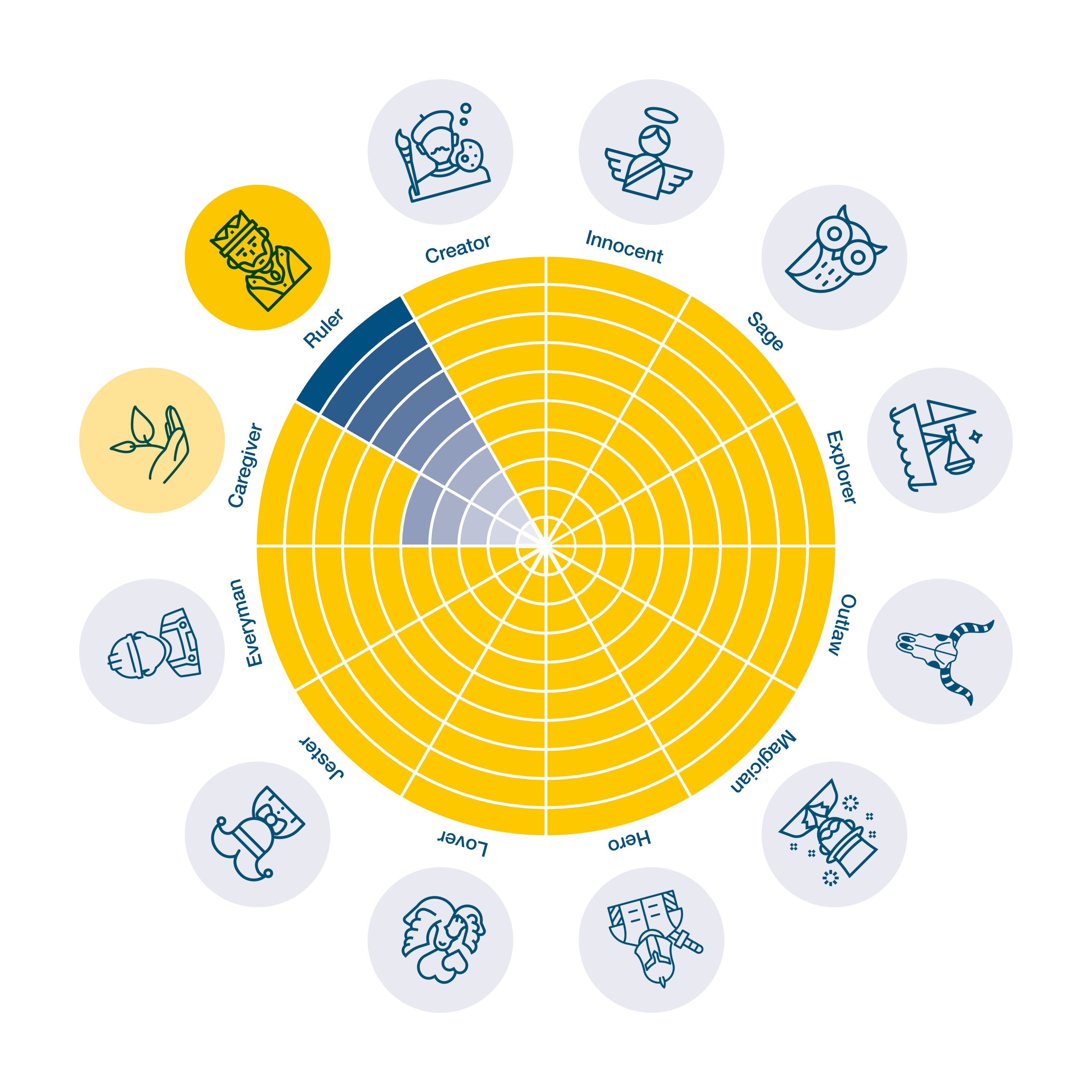
Ruler
Free associations
Association building tools
Logotype (written part of the logo)
The logo in the form of “WebArat” is positively perceived by customers. It is often used in a shortened form as WA. The first part “Web” associates with the audience that it will be a web-based solution system. Thus, the solution does not burden the client’s infrastructure and does not need to be dedicated to its management and security.
The second part of the brand name “Arat” is the acronym behind which is hidden the approach and strategy of the WebArat system itself.
Graphic element of the logo
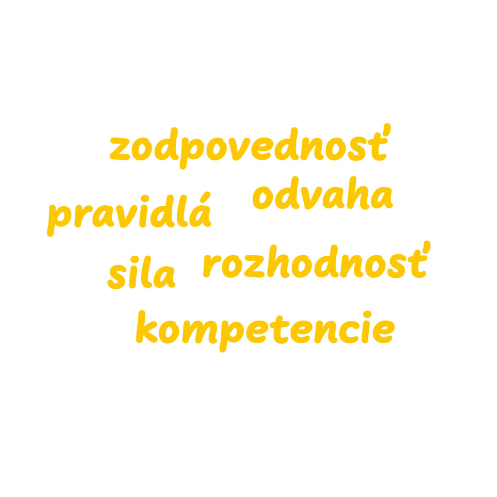
The technical information hidden in the logo needs to be complemented by elements that build the necessary associations. The graphic element assigned to the logotype will develop associations: responsibility, strength, courage, competence.
The shield symbol offers appropriate associations. The shield is also an element of defensive defence. This principle is consistent with the approach to cybersecurity of “being prepared for an attack is the best prerequisite for repelling it”. WebArat offers customers a tool with which they can create a shield over their organization in which every team member can feel safe and secure.

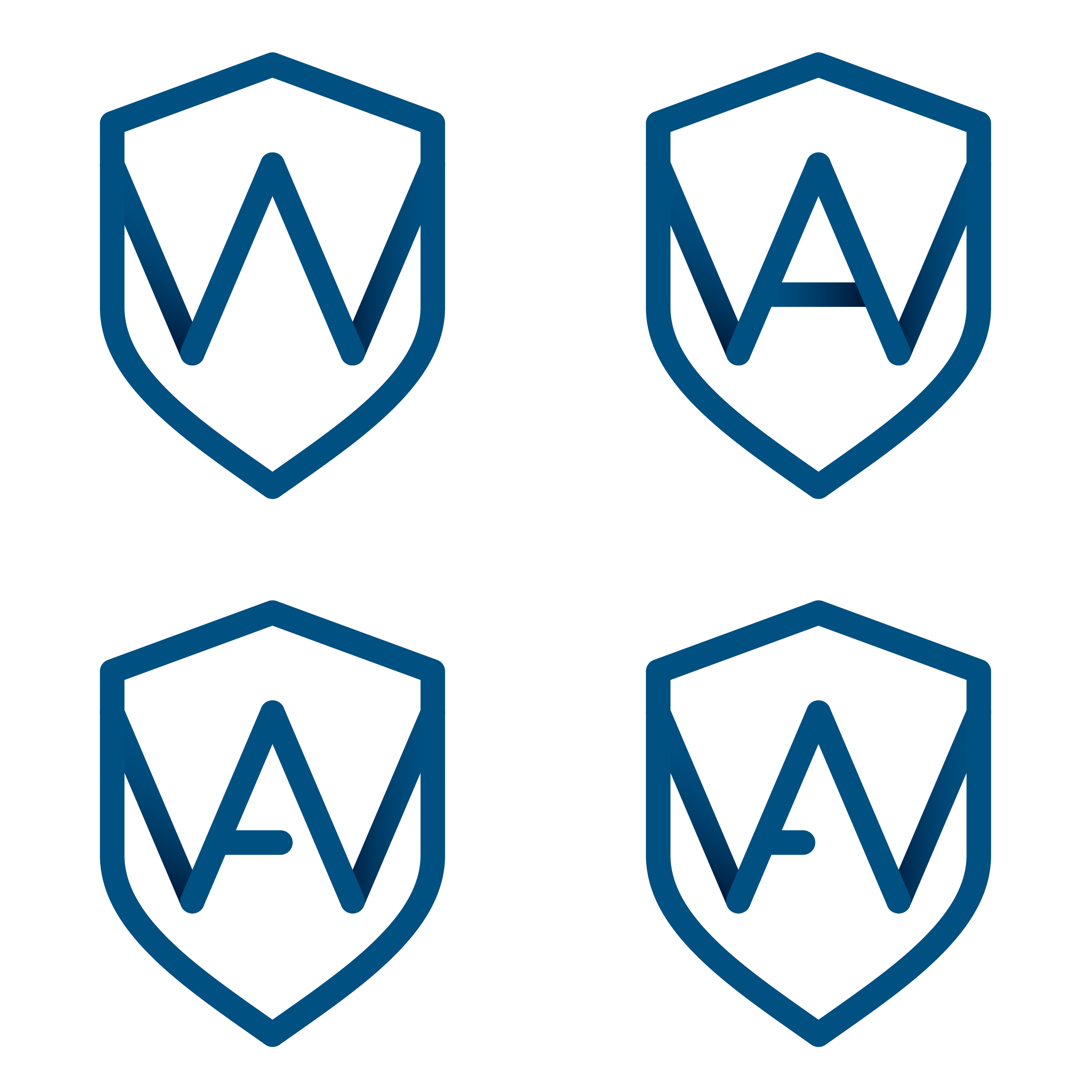
Alternative designs for the symbol “WA”
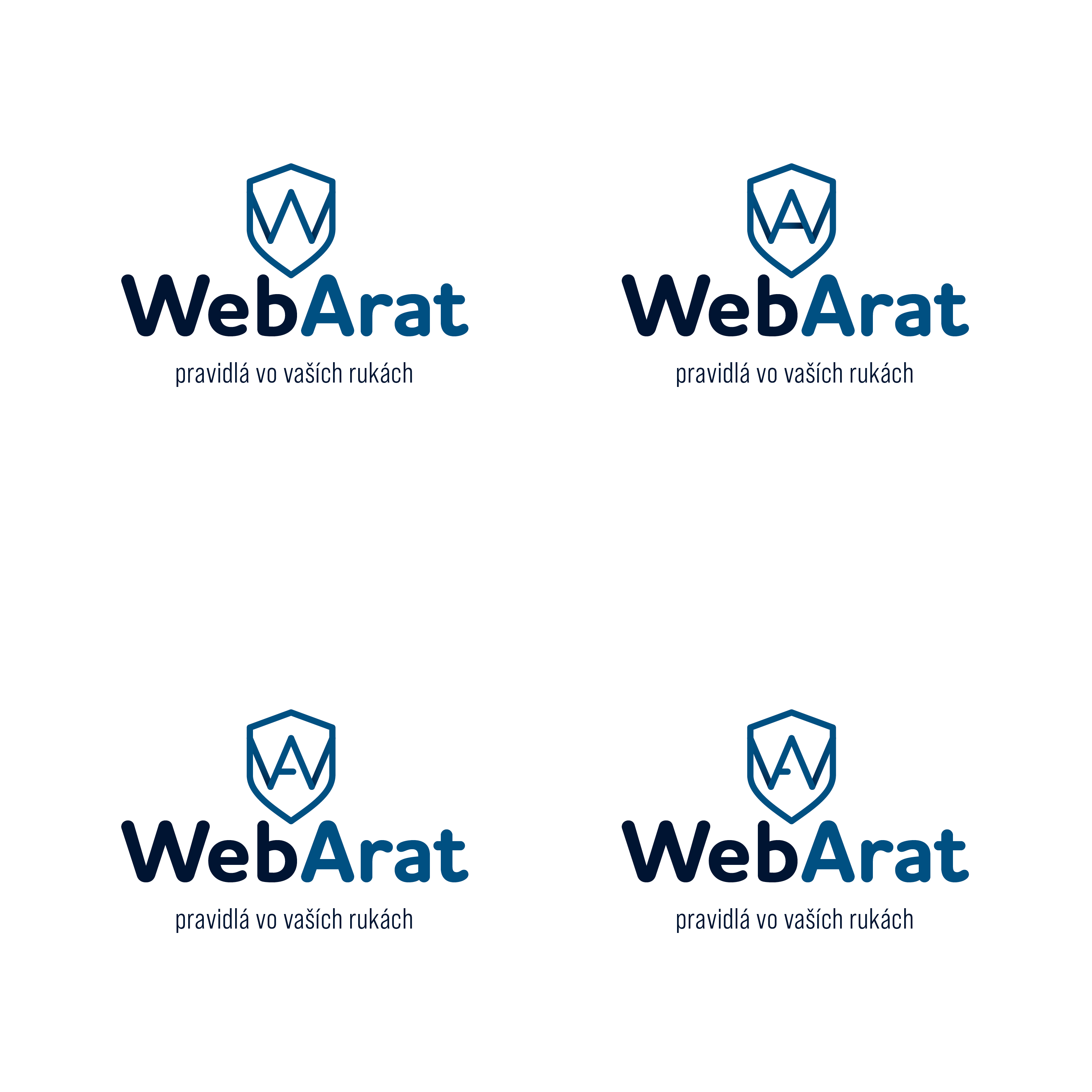
Overview of colour alternatives B

Sample of the “Ruler” illustration visual
Slogan
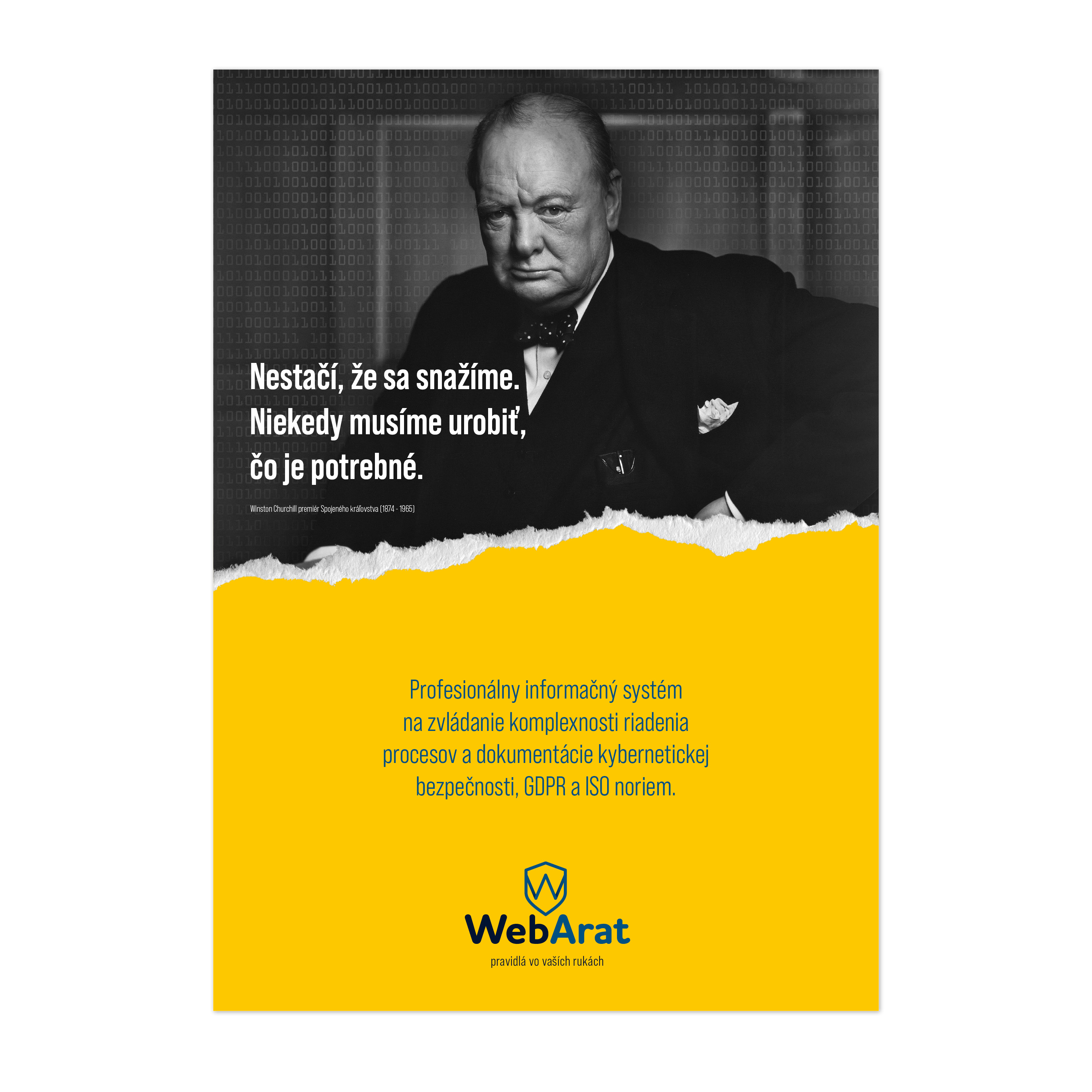
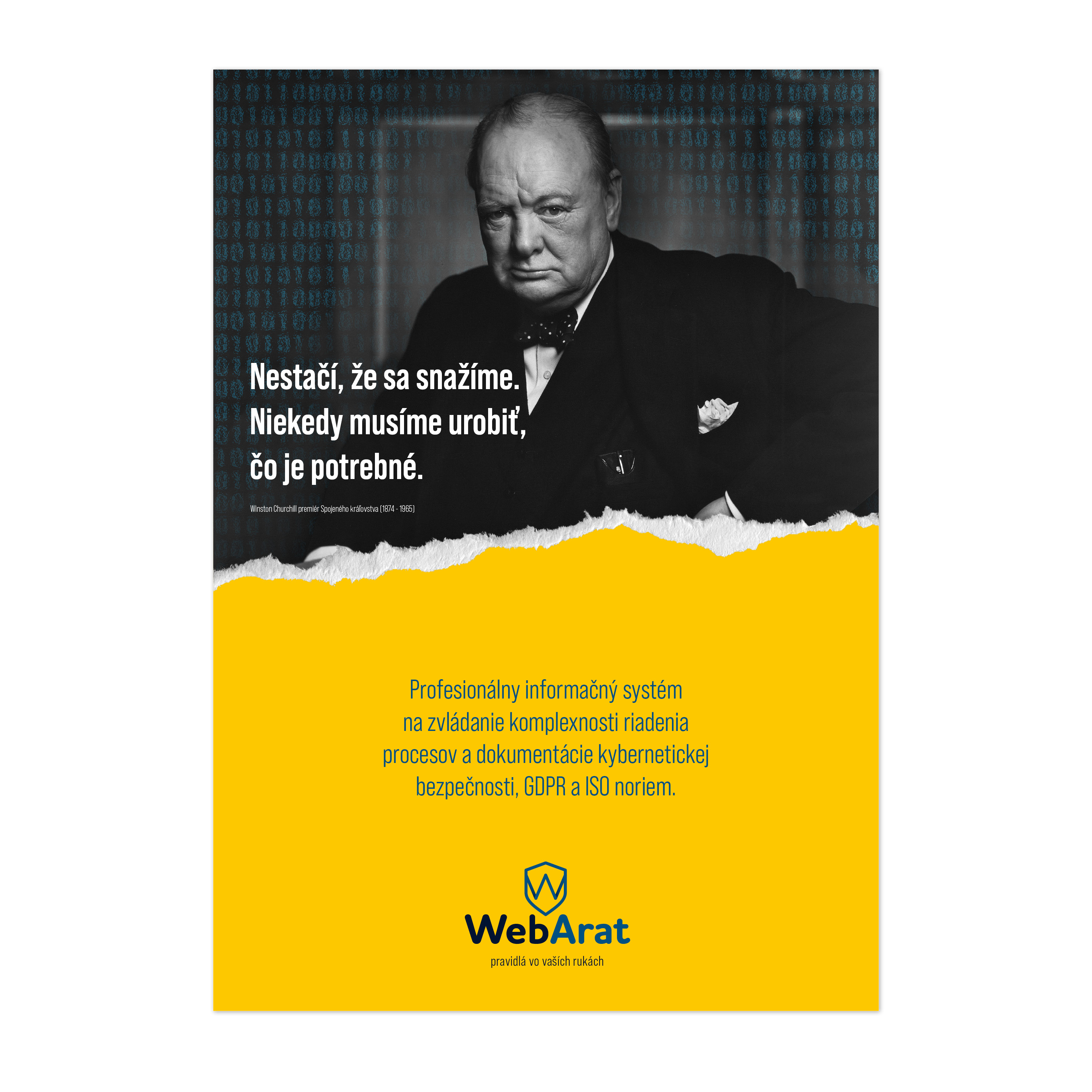
The role of the slogan is to send a clear message. At the same time, it should link the logotype and the symbol into a coherent “sentence” of the basic expression of the company’s ideas and focus.
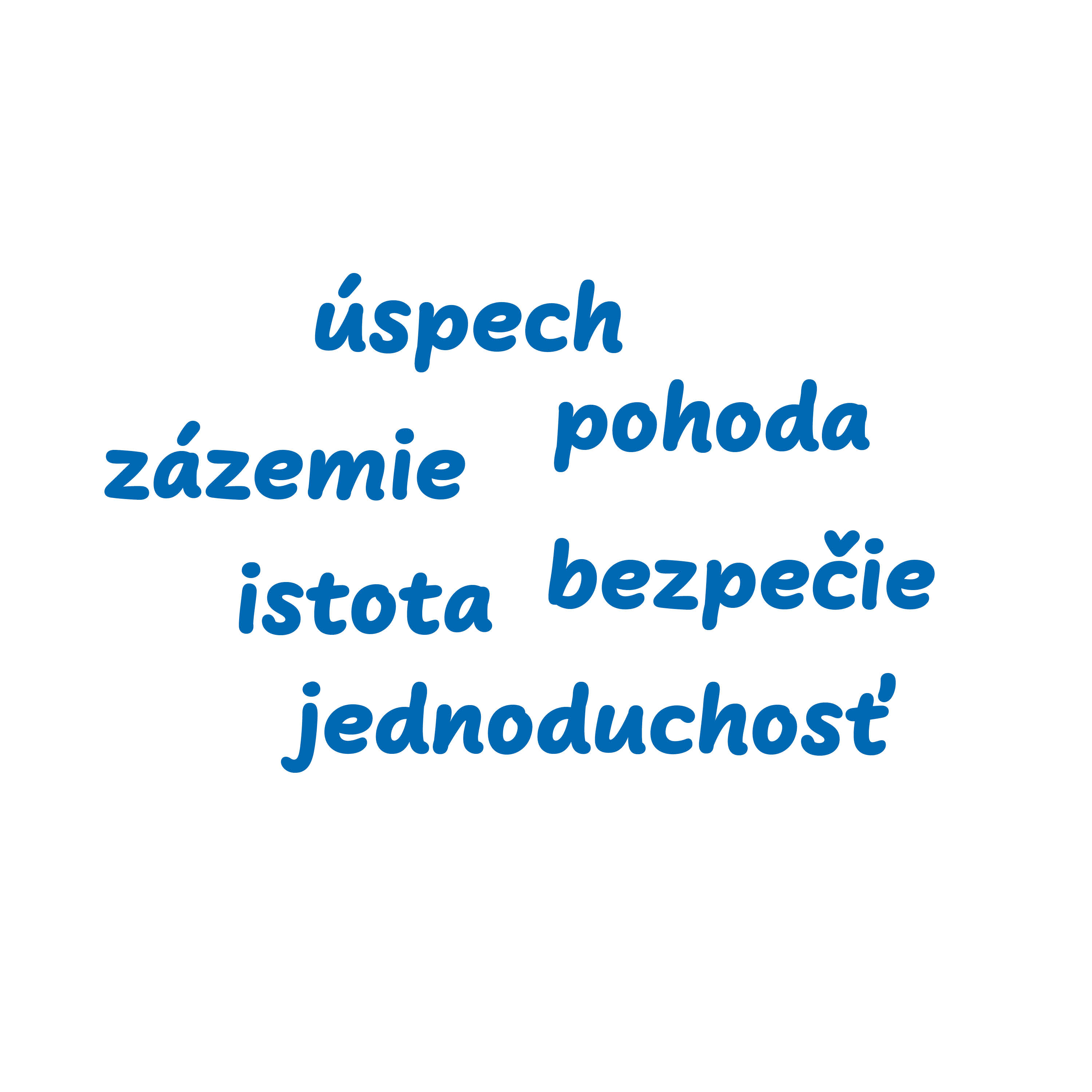
Caregiver, the other face of the brand
The archetype of the caregiver serves as a vindication and reason for the very taking of competence (power) into one’s own hands. The caregiver makes it clear that this is not an initiative in itself but an effort to ensure the stable operation of the organization.
Free associations
Association building tools
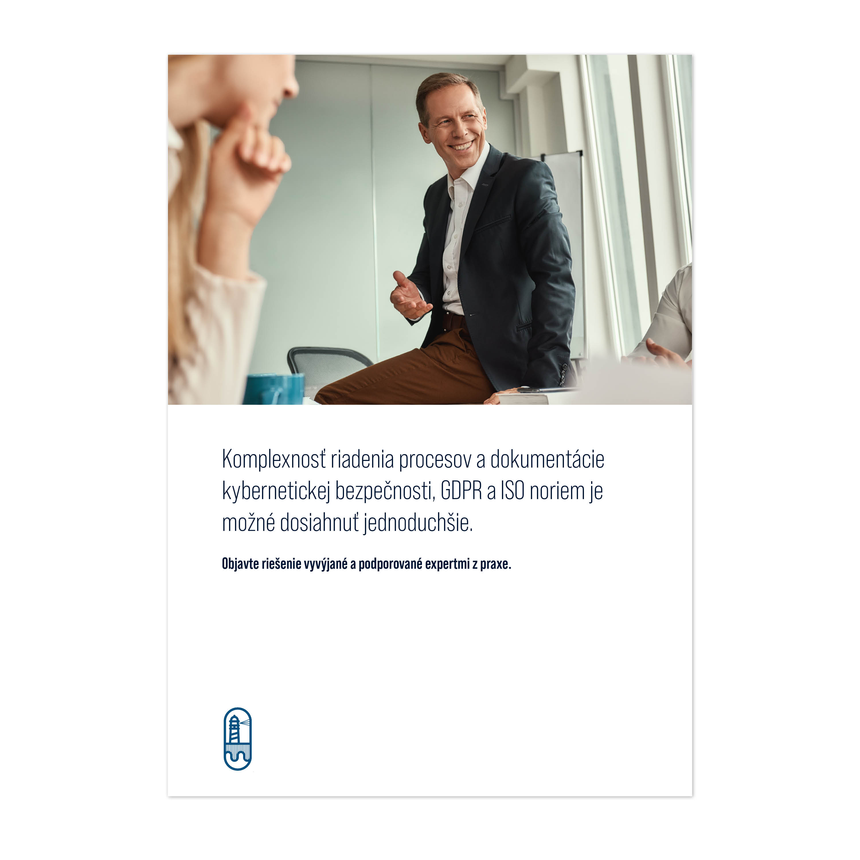
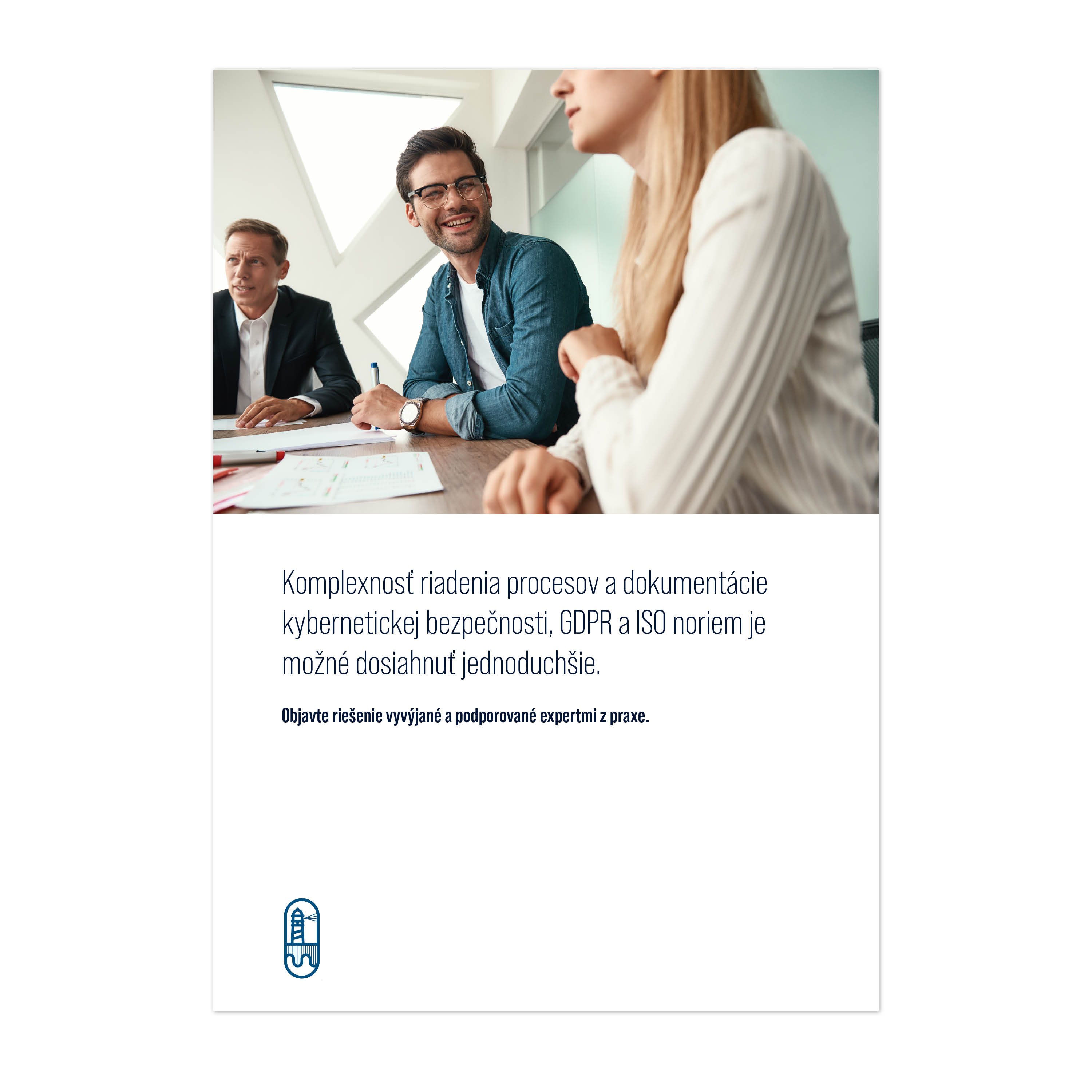
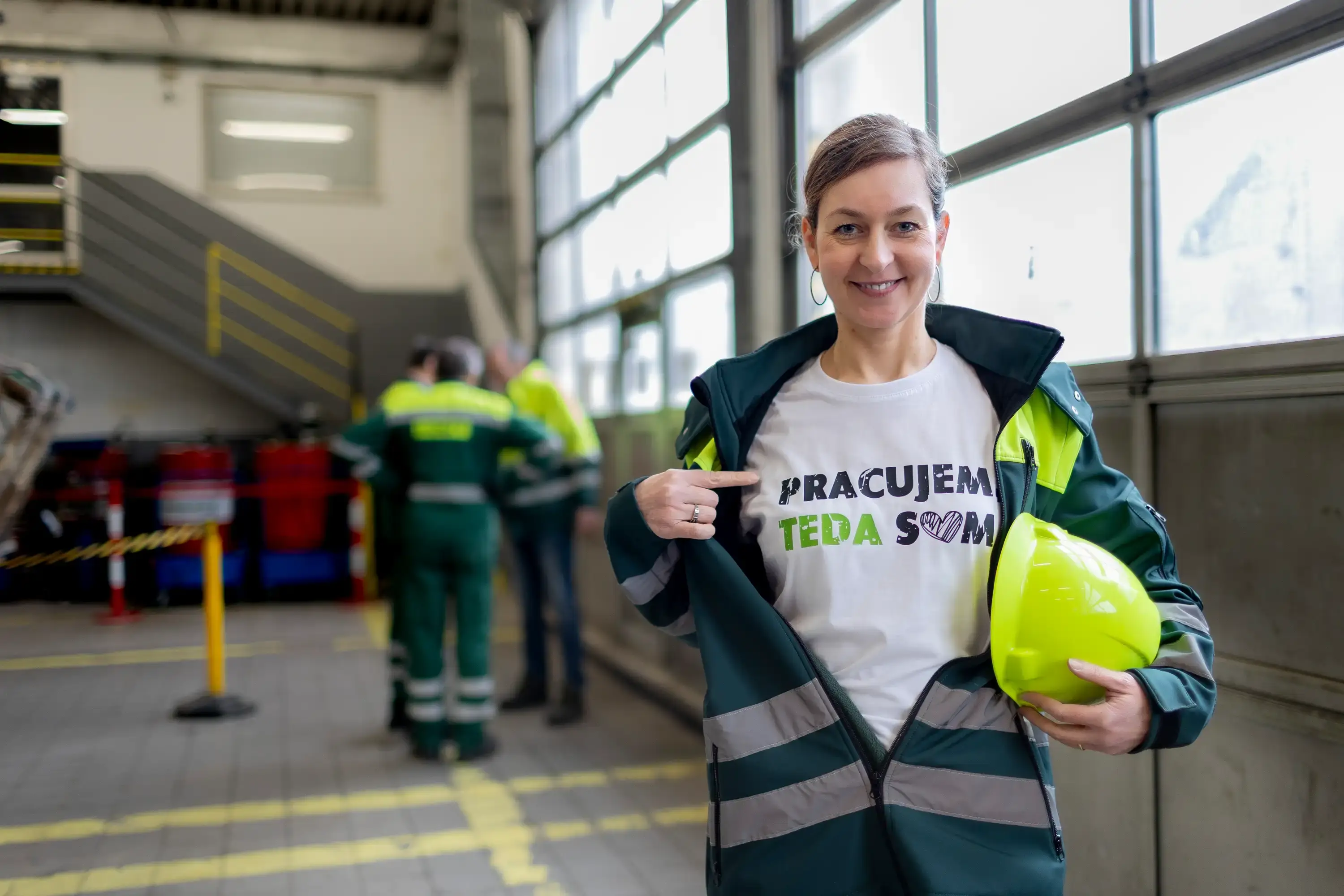
Photo
Company presentations will use photographs of the work environment that exude contentment and safety.
Font and composition
The airy font on a white background should promote a sense of simplicity and security.
Sample illustration visual “Caregiver”
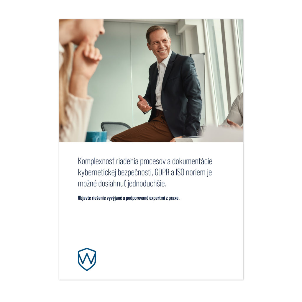
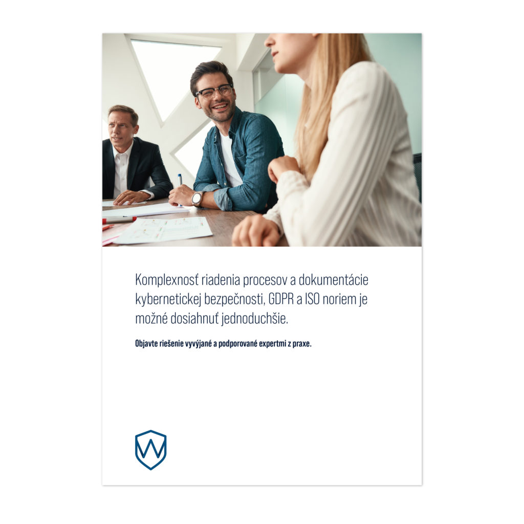
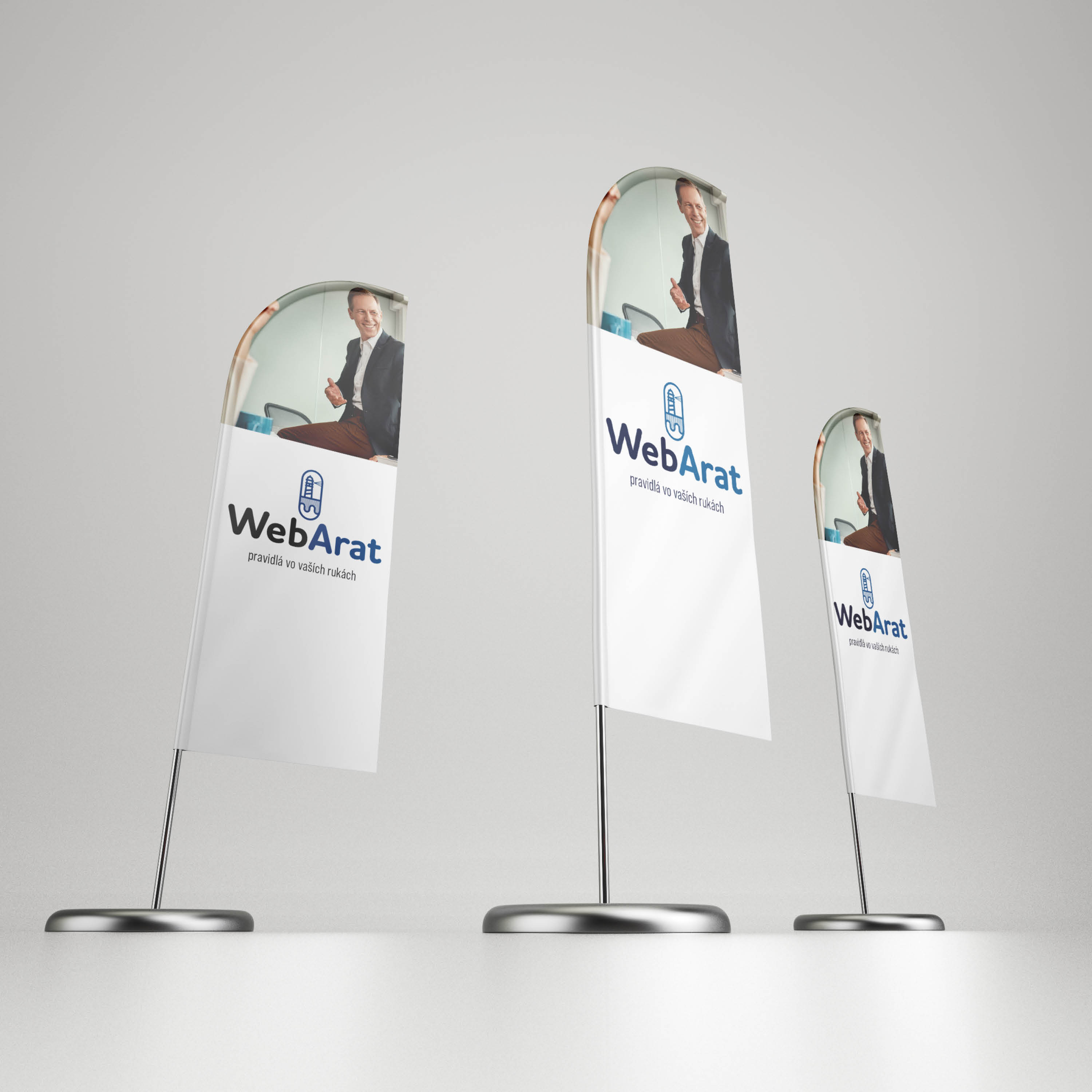
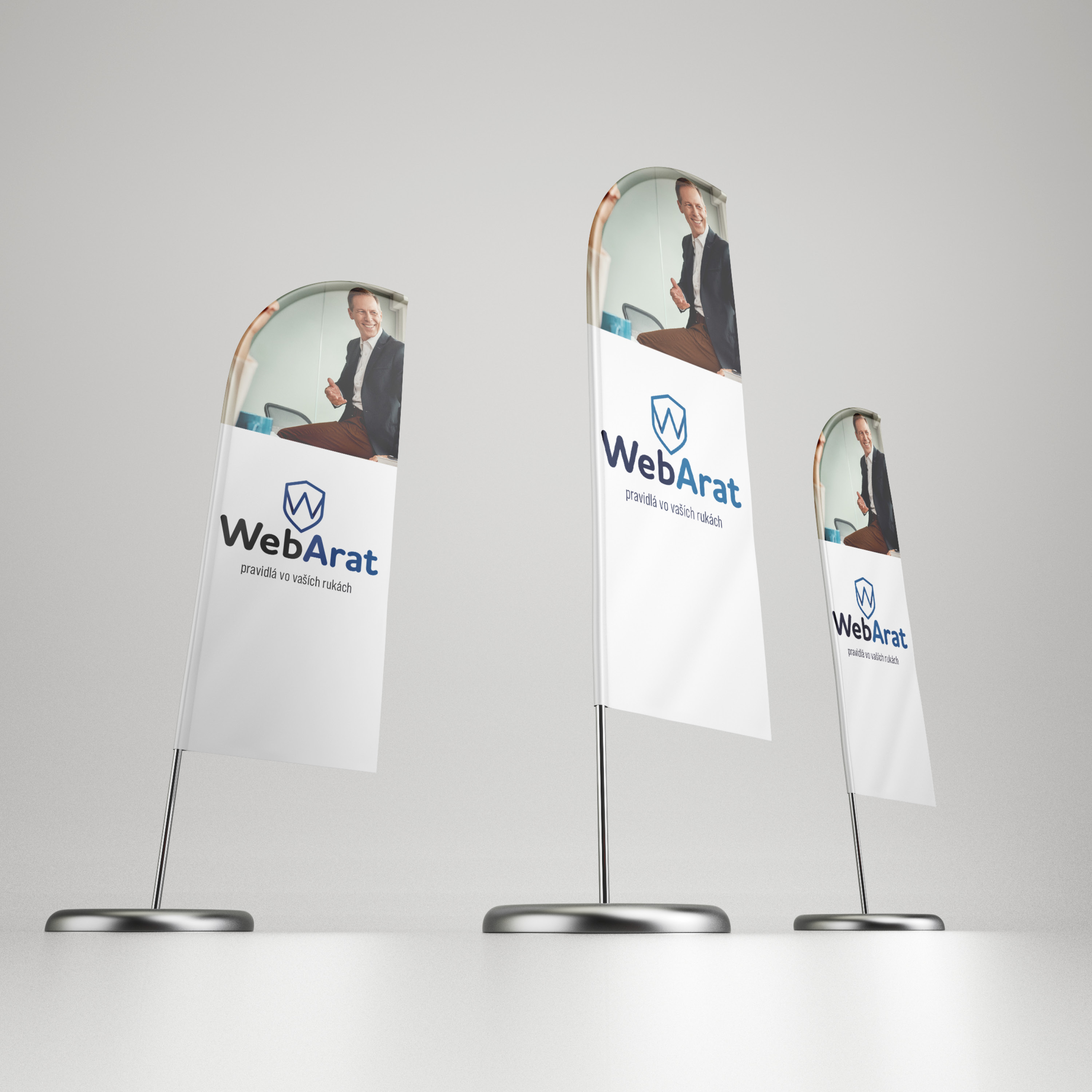
Examples of logotype applications
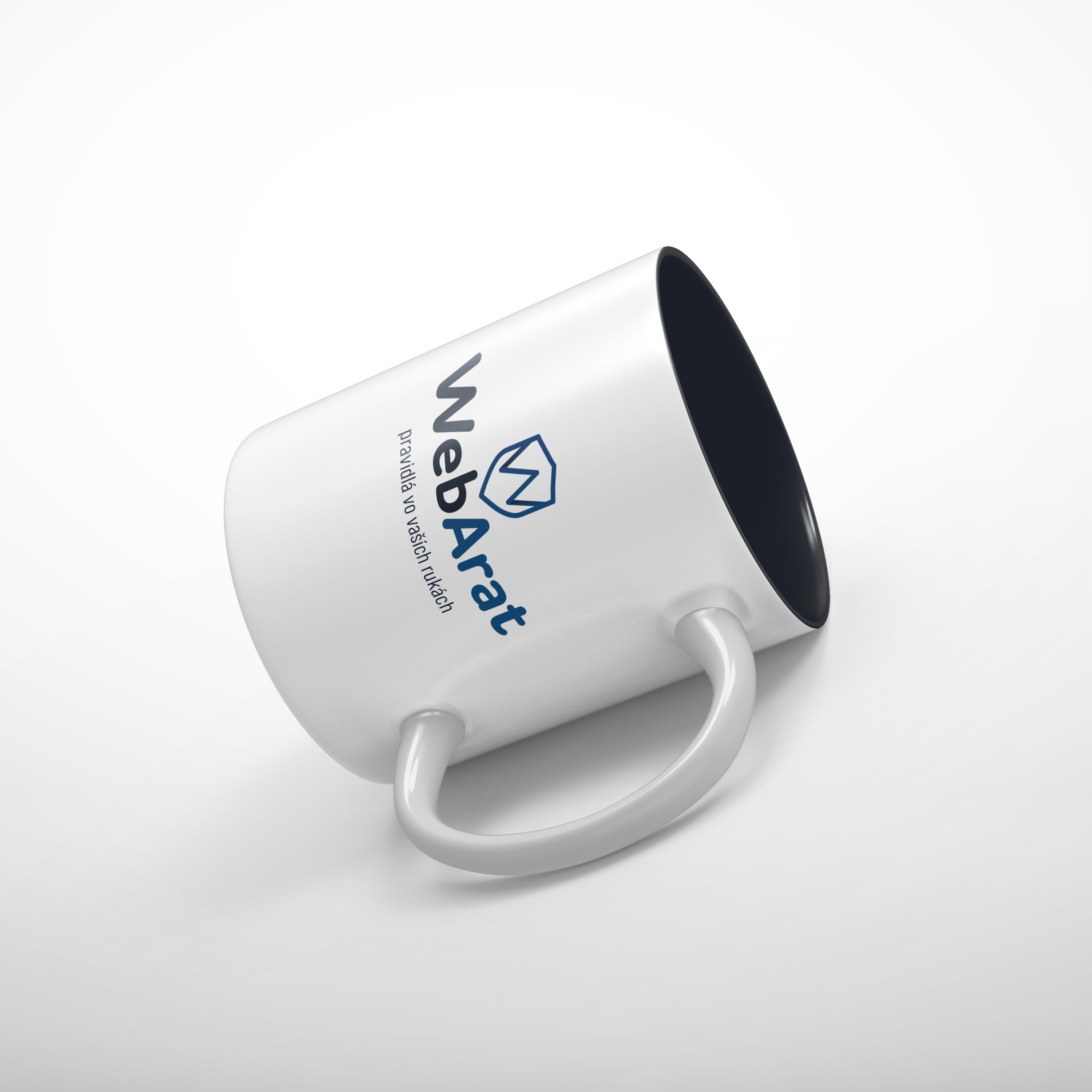

Alternative proposal 1
Association building tools
Logotype (written part of the logo)
The logo in the form of “WebArat” is positively perceived by customers. It is often used in a shortened form as WA. The first part “Web” associates with the audience that it will be a web-based solution system. Thus, the solution does not burden the client’s infrastructure and does not need to be dedicated to its management and security.
The second part of the brand name “Arat” is the acronym behind which is hidden the approach and strategy of the WebArat system itself.
Graphic element of the logo
The technical information hidden in the logo needs to be complemented by elements that build the necessary associations. The graphic element assigned to the logotype will develop associations: responsibility, strength, courage, competence.

The symbol of a continuous attack, an elemental threat, can be represented by the symbol of a wave (force, threat).

It is extremely important especially in difficult moments. The lighthouse does not determine our path, it remains our choice and we determine it based on our current needs. The beacon is a fixed point for us to orient ourselves (courage, control, responsibility, reliability).
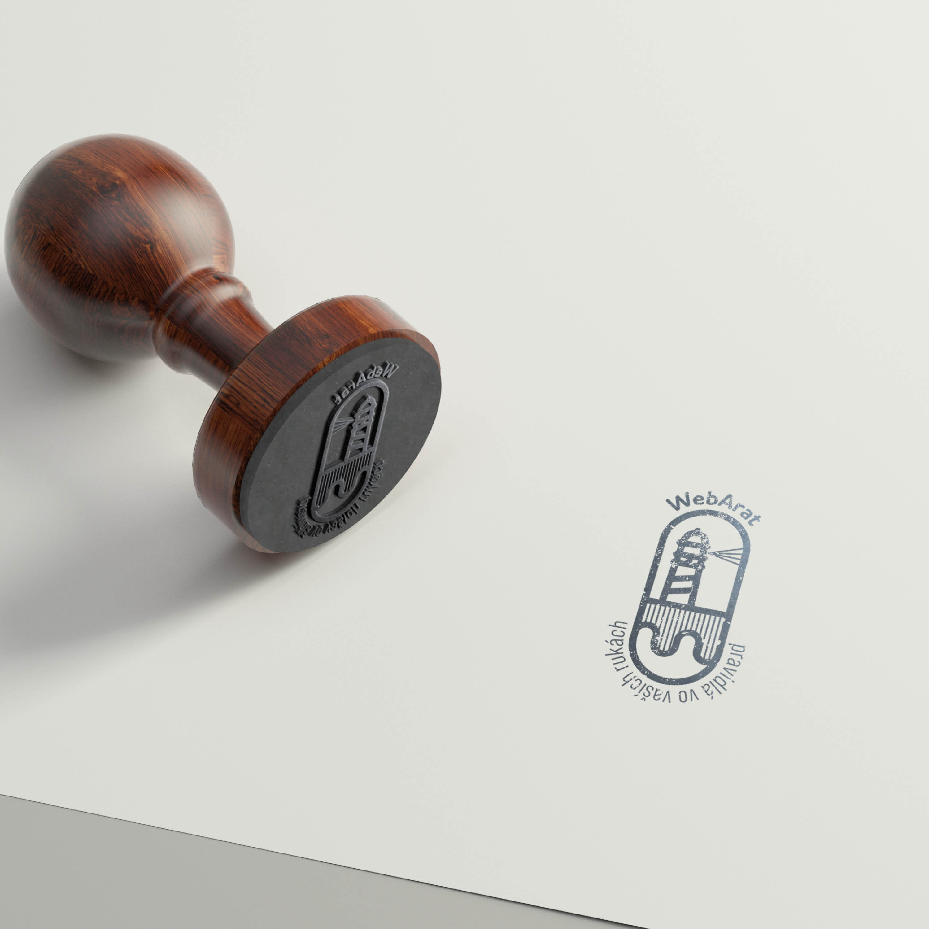
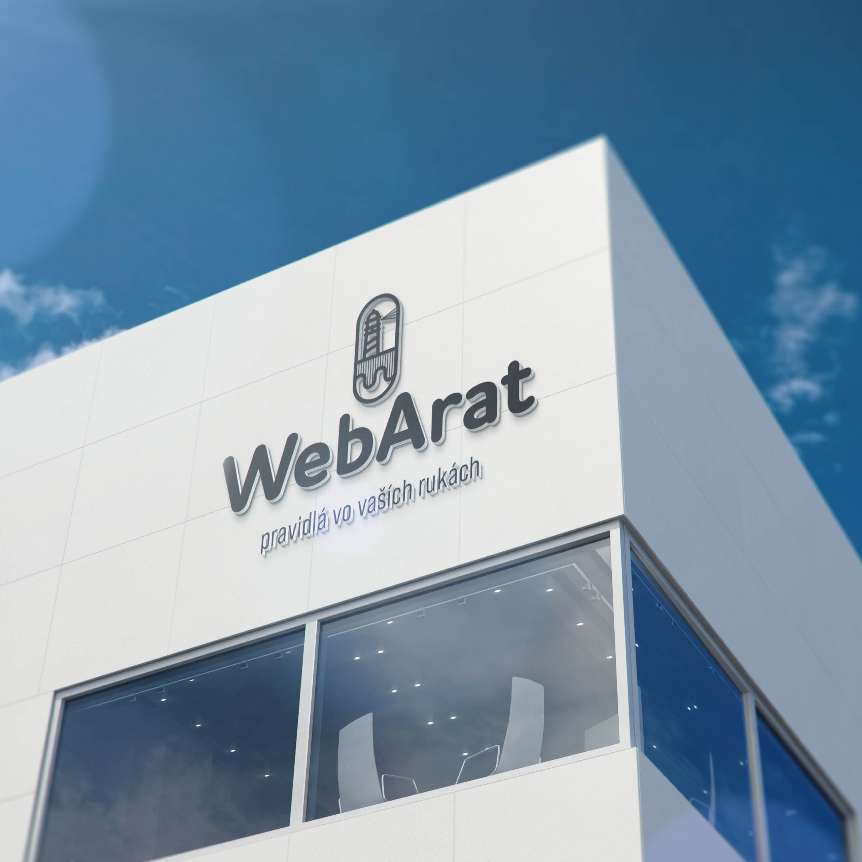
Examples of logotype applications
